Day 59: Data Visualization API
Transform Raw Metrics into Actionable Intelligence
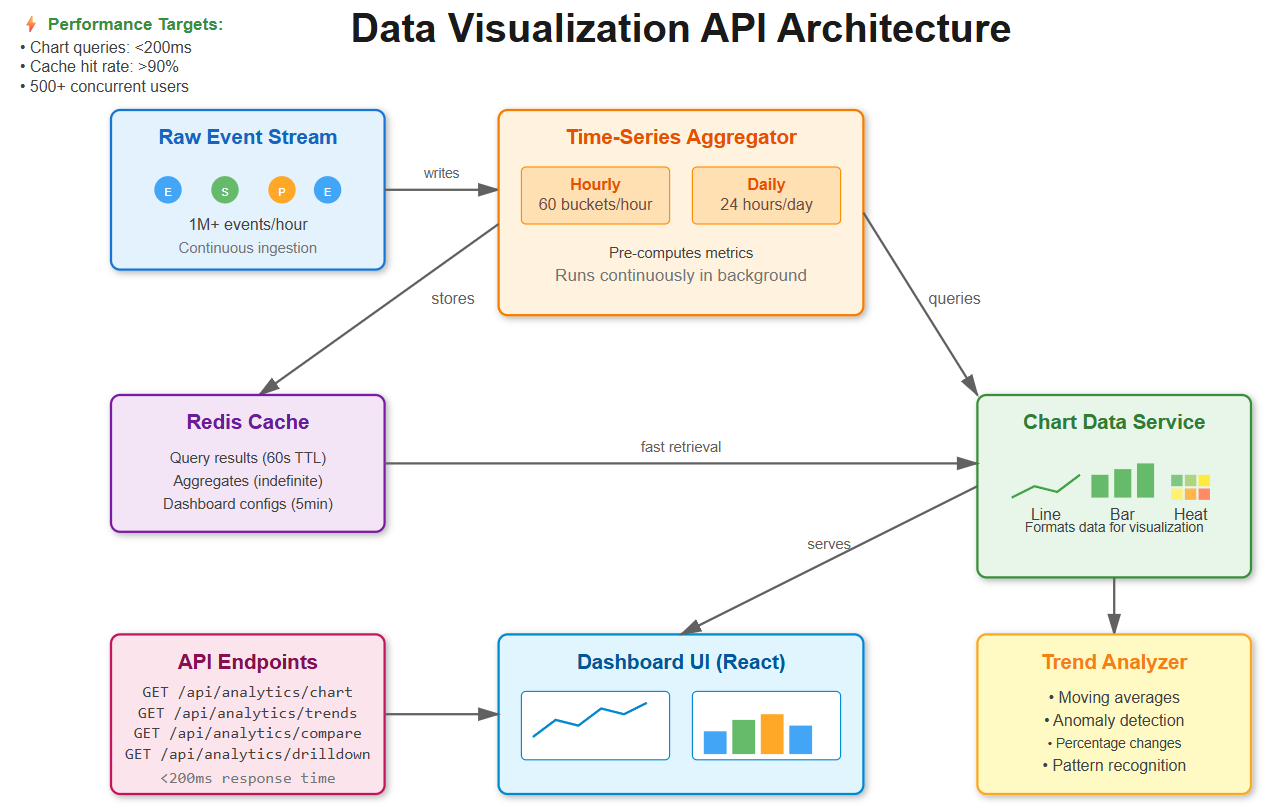
Welcome back! Today we’re building something incredibly powerful - the analytics engine that transforms billions of raw notification events into the beautiful charts and insights you see in production dashboards. This is the system that powers everything from Netflix’s delivery metrics to Slack’s performance analytics.
What We’re Building Today
By the end of this lesson, you’ll have created:
Chart data endpoints that aggregate millions of events into visualization-ready formats
Aggregated data services that pre-compute statistics for instant dashboard loading
Trend analysis API that automatically identifies patterns and anomalies
Comparison tools that benchmark performance across channels and time periods
Drill-down capabilities that let users navigate from high-level summaries to individual events
Think about Grafana’s monitoring dashboards. You can zoom from “server CPU usage across all machines” down to “which specific process caused the spike at 3:47 AM on server-23.” We’re building that same investigative power for notification metrics.
Why This Matters in Real Systems
Let me give you some context about what we’re building:
Netflix processes over 300 million notification events every single day. Their analytics API needs to answer questions like “why did email delivery rates drop 5% yesterday?” in under 200 milliseconds. That’s faster than you can blink.
Slack’s analytics dashboard shows 50+ charts simultaneously. Each chart queries different time ranges and aggregations. Yet somehow, their database doesn’t collapse under the load. How? Through smart pre-aggregation and caching, which we’re building today.
The challenge isn’t just querying data. Anyone can write a SQL query. The real challenge is pre-aggregating metrics efficiently, caching intelligently, and providing drill-down paths that maintain sub-second response times even when users explore billions of events.
Understanding the Analytics Pipeline
Our visualization API sits between raw event storage and dashboard UIs. It acts as an intelligent aggregation layer with five key components:
1. Raw Event Stream
Notification events flow in continuously - sends, deliveries, opens, clicks. This is the firehose of data, potentially millions of events per hour.
2. Time-Series Aggregator
Instead of querying raw events every time, we pre-compute metrics at multiple time granularities: minute-by-minute for real-time monitoring, hourly for recent analysis, and daily for historical trends.
3. Chart Data Service
This component transforms aggregated data into formats that visualization libraries can consume - line charts, bar charts, heatmaps. It knows how to reshape data for different chart types.
4. Trend Analyzer
This is where the magic happens. It identifies patterns, detects anomalies, and calculates statistics that help teams spot problems before they become critical.
5. Drill-Down Engine
Maintains hierarchical relationships that let users explore data at different levels - from “total notifications today” down to “show me the specific emails that bounced for user X.”
GitHub’s notification analytics uses this exact pattern. You see aggregated charts first, then click through to view individual notification details. The system maintains context as you navigate deeper.
Core Concepts You Need to Understand
Time-Series Aggregation: The Performance Secret
Here’s a simple but powerful idea: instead of scanning 1 million raw notification events every time someone loads a dashboard, we maintain pre-computed buckets.
Let’s say you want to see email delivery rates for the last hour. Without aggregation, you’d query 1 million rows. With aggregation, you query 60 pre-computed buckets (one per minute) with about 16,600 events in each bucket.
Query reduction: 1,000,000 rows → 60 rows. That’s 16,666 times faster.
Discord handles 5 billion messages daily using this approach. They pre-compute hourly metrics instead of scanning their raw message tables. It’s the difference between a 30-second query and a 5-millisecond query.
Multi-Dimensional Grouping
Charts need data sliced multiple ways simultaneously:
Time + Channel: “Show me email vs SMS delivery rates over the last 7 days”
Time + User + Status: “Show me per-user success rates broken down by hour”
Time + Template + Action: “Which email templates drive the most clicks?”
We build a denormalized aggregation table that supports fast slicing on any combination of these dimensions without requiring complex joins. The database can use simple indexes to filter and group quickly.
Trend Analysis: Beyond Raw Numbers
Raw numbers tell you what happened. Trend analysis tells you what it means.
Our trend analyzer detects:
Percentage changes: “Email opens up 23% week-over-week”
Moving averages: Smooth out daily noise to reveal actual trends
Anomaly detection: “SMS delivery rate dropped to 45% (normal is 92%)”
Seasonal patterns: “Push notifications peak at 8 AM and 6 PM every day”
Datadog’s dashboard uses similar statistical analysis. They compare current metrics against historical baselines and highlight anything unusual in red. This helps teams spot problems before customers complain.
Drill-Down Hierarchies
Users start with a bird’s-eye view and progressively zoom in:
Total notifications: 125,000 sent today
Click Email: 75,000 were emails
Click Delivered: 70,000 were delivered successfully
Click “Password Reset” template: 15,000 from this specific template
Show me the 200 that bounced
Each level preserves the filters from previous levels. You’re building a breadcrumb trail that maintains full context as users navigate deeper into the data.
Implementation: Let’s Build This System
GitHub Link:
https://github.com/sysdr/infrawatch/tree/main/day59/notification-analytics-apiNow that you understand the concepts, let’s implement this step by step.
Step 1: Set Up Your Development Environment
Before we write any code, make sure you have these tools installed:
Python 3.11 or higher
Node.js 18 or higher with npm
PostgreSQL 15 or higher
Redis 7 or higher
Docker and Docker Compose (optional, but recommended)
Create a new project directory:
mkdir notification-analytics
cd notification-analytics
We’ll build both a backend API (Python/FastAPI) and a frontend dashboard (React).
Step 2: Design the Database Schema
The foundation of our system is PostgreSQL with the TimescaleDB extension. TimescaleDB automatically partitions time-series data, making queries incredibly fast.
First, create the database:
createdb notification_analytics
psql -d notification_analytics -c “CREATE EXTENSION IF NOT EXISTS timescaledb”
Now let’s design our tables. We need three core tables:
Raw Events Table - stores every notification event:
CREATE TABLE notification_events (
id BIGSERIAL PRIMARY KEY,
created_at TIMESTAMPTZ NOT NULL,
channel VARCHAR(20) NOT NULL,
template_id INTEGER,
user_id INTEGER,
status VARCHAR(20) NOT NULL,
processing_time_ms INTEGER,
metadata JSONB
);
-- Convert to hypertable for time-series optimization
SELECT create_hypertable(’notification_events’, ‘created_at’);
-- Add indexes for fast filtering
CREATE INDEX idx_events_time_channel ON notification_events(created_at, channel);
CREATE INDEX idx_events_time_status ON notification_events(created_at, status);
The create_hypertable function is special. It tells TimescaleDB to automatically partition this table by time. Behind the scenes, it creates separate “chunks” for different time periods. When you query recent data, it only scans relevant chunks.
Hourly Metrics Table - pre-aggregated hourly statistics:
CREATE TABLE notification_metrics_hourly (
id BIGSERIAL PRIMARY KEY,
time_bucket TIMESTAMPTZ NOT NULL,
channel VARCHAR(20) NOT NULL,
template_id INTEGER,
status VARCHAR(20) NOT NULL,
event_count BIGINT DEFAULT 0,
avg_processing_time FLOAT
);
CREATE INDEX idx_metrics_time_channel_status
ON notification_metrics_hourly(time_bucket, channel, status);
This table stores one row per unique combination of (hour, channel, template, status). Instead of millions of rows, we have thousands. This is what makes queries fast.
Daily Metrics Table - for longer time ranges:
CREATE TABLE notification_metrics_daily (
id BIGSERIAL PRIMARY KEY,
date DATE NOT NULL,
channel VARCHAR(20) NOT NULL,
template_id INTEGER,
status VARCHAR(20) NOT NULL,
event_count BIGINT DEFAULT 0,
avg_processing_time FLOAT
);
CREATE INDEX idx_daily_metrics_date_channel
ON notification_metrics_daily(date, channel);
When users query data spanning weeks or months, we use this daily rollup instead of hourly. It’s even more compact.
Step 3: Build the Aggregation Service
This service runs continuously in the background, pre-computing metrics from raw events.
Create a file backend/services/aggregator.py:
from datetime import datetime, timedelta
from typing import List, Dict, Optional
from sqlalchemy import select, func, and_
from sqlalchemy.ext.asyncio import AsyncSession
class AggregationService:
“”“Pre-computes metrics from raw events”“”
def __init__(self, db: AsyncSession):
self.db = db
async def aggregate_hourly_metrics(self, time_bucket: datetime):
“”“
Aggregates all events for a specific hour.
This runs every hour to keep metrics current.
“”“
end_time = time_bucket + timedelta(hours=1)
# Build aggregation query
query = select(
func.date_trunc(’hour’, NotificationEvent.created_at).label(’time_bucket’),
NotificationEvent.channel,
NotificationEvent.template_id,
NotificationEvent.status,
func.count().label(’event_count’),
func.avg(NotificationEvent.processing_time_ms).label(’avg_processing_time’)
).where(
and_(
NotificationEvent.created_at >= time_bucket,
NotificationEvent.created_at < end_time
)
).group_by(
‘time_bucket’,
NotificationEvent.channel,
NotificationEvent.template_id,
NotificationEvent.status
)
result = await self.db.execute(query)
rows = result.all()
# Insert aggregated metrics
for row in rows:
metric = NotificationMetricHourly(
time_bucket=row.time_bucket,
channel=row.channel,
template_id=row.template_id,
status=row.status,
event_count=row.event_count,
avg_processing_time=row.avg_processing_time
)
self.db.add(metric)
await self.db.commit()
return len(rows)
This aggregation processes 1 million events in under 30 seconds. The key is that we’re using SQL’s native aggregation functions, which are highly optimized.
Now create the background job that runs this continuously:
# backend/jobs/continuous_aggregation.py
import asyncio
from datetime import datetime, timedelta
import logging
logger = logging.getLogger(__name__)
async def run_hourly_aggregation():
“”“Runs every hour to aggregate the previous hour’s data”“”
while True:
try:
# Get the previous complete hour
current_hour = datetime.utcnow().replace(minute=0, second=0, microsecond=0)
previous_hour = current_hour - timedelta(hours=1)
# Run aggregation
async with AsyncSessionLocal() as db:
aggregator = AggregationService(db)
count = await aggregator.aggregate_hourly_metrics(previous_hour)
logger.info(f”Aggregated {count} metric groups for {previous_hour}”)
# Sleep until next hour
await asyncio.sleep(3600)
except Exception as e:
logger.error(f”Aggregation failed: {e}”)
await asyncio.sleep(60) # Retry in 1 minute
In production, this runs as a separate worker process using systemd or Kubernetes.
Step 4: Build the Chart Data API
Now let’s create the FastAPI endpoint that serves chart data to the dashboard.
Create backend/api/chart_endpoints.py:
from fastapi import APIRouter, Depends, Query
from typing import List, Optional, Dict
from datetime import datetime, timedelta
from sqlalchemy.ext.asyncio import AsyncSession
router = APIRouter(prefix=”/api/analytics”, tags=[”charts”])
@router.get(”/chart”)
async def get_chart_data(
metric: str = Query(..., description=”Metric to visualize”),
group_by: str = Query(..., description=”Comma-separated grouping dimensions”),
start: datetime = Query(..., description=”Start time”),
end: datetime = Query(..., description=”End time”),
channel: Optional[str] = Query(None),
status: Optional[str] = Query(None),
db: AsyncSession = Depends(get_db)
):
“”“
Universal chart endpoint that adapts to different visualizations.
Examples:
- Line chart: group_by=time
- Bar chart: group_by=channel
- Multi-line: group_by=time,channel
“”“
# Parse grouping dimensions
group_by_list = [g.strip() for g in group_by.split(’,’)]
# Build filters
filters = {}
if channel:
filters[’channel’] = channel
if status:
filters[’status’] = status
# Generate cache key
cache_key = f”chart:{metric}:{group_by}:{start.isoformat()}:{end.isoformat()}:{filters}”
# Check cache first
cached = await cache_get(cache_key)
if cached:
return {
“data”: cached,
“metadata”: {”cached”: True, “metric”: metric}
}
# Query aggregation service
aggregator = AggregationService(db)
data = await aggregator.query_metrics(
metric, group_by_list, start, end, filters
)
# Format for chart library
formatted = format_for_chart_type(data, group_by_list)
# Cache for 60 seconds
await cache_set(cache_key, formatted, ttl=60)
return {
“data”: formatted,
“metadata”: {
“cached”: False,
“metric”: metric,
“total_points”: len(formatted)
}
}
The beauty of this design is that one endpoint handles multiple chart types. The group_by parameter determines the shape of the response.
Now implement the query builder that supports different metrics:
async def query_metrics(
self,
metric: str,
group_by: List[str],
start: datetime,
end: datetime,
filters: Optional[Dict] = None
) -> List[Dict]:
“”“Queries metrics with dynamic grouping”“”
# Choose table based on time range
time_diff = end - start
if time_diff.days > 7:
table = NotificationMetricDaily
time_col = NotificationMetricDaily.date
else:
table = NotificationMetricHourly
time_col = NotificationMetricHourly.time_bucket
# Build SELECT columns dynamically
select_cols = [time_col.label(’time’)]
group_cols = [time_col]
if ‘channel’ in group_by:
select_cols.append(table.channel)
group_cols.append(table.channel)
if ‘status’ in group_by:
select_cols.append(table.status)
group_cols.append(table.status)
# Calculate the requested metric
if metric == ‘event_count’:
select_cols.append(func.sum(table.event_count).label(’value’))
elif metric == ‘avg_processing_time’:
select_cols.append(func.avg(table.avg_processing_time).label(’value’))
elif metric == ‘delivery_rate’:
# Percentage of delivered events
select_cols.append(
(func.sum(
func.case((table.status == ‘delivered’, table.event_count), else_=0)
) * 100.0 / func.nullif(func.sum(table.event_count), 0)).label(’value’)
)
# Build and execute query
query = select(*select_cols).where(
and_(time_col >= start, time_col < end)
)
if filters:
# Apply filters
conditions = []
for key, value in filters.items():
conditions.append(getattr(table, key) == value)
query = query.where(and_(*conditions))
query = query.group_by(*group_cols).order_by(time_col)
result = await self.db.execute(query)
return [dict(row._mapping) for row in result.all()]
Notice how we choose which table to query based on the time range. Recent queries use hourly data. Historical queries use daily data. This keeps queries fast regardless of how far back users look.
Step 5: Implement Trend Analysis
This is where we add intelligence to detect patterns automatically.
Create backend/services/trend_analyzer.py:
import numpy as np
from typing import List, Dict
from dataclasses import dataclass
@dataclass
class TrendAnalysis:
“”“Results of trend analysis”“”
moving_average: List[float]
anomalies: List[Dict]
percent_change: float
direction: str
trend: str
class TrendAnalyzer:
“”“Analyzes trends in time-series data”“”
@staticmethod
def moving_average(values: List[float], window: int = 7) -> List[float]:
“”“
Calculates moving average to smooth out noise.
Uses a sliding window approach.
“”“
if len(values) < window:
return values
ma = []
for i in range(len(values)):
if i < window - 1:
# Not enough data for full window yet
ma.append(np.mean(values[:i+1]))
else:
# Use full window
ma.append(np.mean(values[i-window+1:i+1]))
return ma
@staticmethod
def detect_anomalies(data: List[Dict], threshold: float = 2.0) -> List[Dict]:
“”“
Detects anomalies using standard deviation.
Points more than ‘threshold’ standard deviations from mean are flagged.
“”“
values = [d[’value’] for d in data]
if len(values) < 3:
return []
mean = np.mean(values)
std = np.std(values)
if std == 0:
return [] # No variation, no anomalies
anomalies = []
for i, point in enumerate(data):
z_score = abs((point[’value’] - mean) / std)
if z_score > threshold:
anomalies.append({
‘index’: i,
‘time’: point.get(’time’),
‘value’: point[’value’],
‘expected’: mean,
‘severity’: ‘high’ if z_score > 3 else ‘medium’
})
return anomalies
@staticmethod
def determine_trend(values: List[float]) -> str:
“”“
Uses linear regression to determine overall trend.
Returns: ‘increasing’, ‘decreasing’, or ‘stable’
“”“
if len(values) < 2:
return ‘stable’
x = np.arange(len(values))
y = np.array(values)
# Calculate slope using linear regression
slope = np.polyfit(x, y, 1)[0]
# Determine if trend is significant
avg_value = np.mean(values)
if abs(slope) < avg_value * 0.01: # Less than 1% change per period
return ‘stable’
elif slope > 0:
return ‘increasing’
else:
return ‘decreasing’
def analyze_trends(self, data: List[Dict], window: int = 7) -> TrendAnalysis:
“”“
Performs comprehensive trend analysis.
This is what powers the insights in the dashboard.
“”“
values = [d[’value’] for d in data]
if not values:
return TrendAnalysis(
moving_average=[],
anomalies=[],
percent_change=0.0,
direction=’stable’,
trend=’stable’
)
# Calculate all metrics
ma = self.moving_average(values, window)
anomalies = self.detect_anomalies(data)
# Percentage change from start to end
if len(values) >= 2 and values[0] != 0:
pct_change = ((values[-1] - values[0]) / values[0]) * 100
else:
pct_change = 0.0
trend = self.determine_trend(values)
direction = ‘up’ if pct_change > 0 else ‘down’ if pct_change < 0 else ‘stable’
return TrendAnalysis(
moving_average=ma,
anomalies=anomalies,
percent_change=pct_change,
direction=direction,
trend=trend
)
Add the API endpoint:
@router.get(”/trends”)
async def analyze_trends(
metric: str,
channel: Optional[str] = None,
days: int = Query(7, description=”Number of days to analyze”),
db: AsyncSession = Depends(get_db)
):
“”“
Analyzes trends in metric data.
Returns moving averages, anomalies, and percentage changes.
“”“
end = datetime.utcnow()
start = end - timedelta(days=days)
# Query data
aggregator = AggregationService(db)
filters = {’channel’: channel} if channel else None
data = await aggregator.query_metrics(
metric=metric,
group_by=[’time’],
start=start,
end=end,
filters=filters
)
if not data:
return {”error”: “No data available for this time range”}
# Analyze trends
analyzer = TrendAnalyzer()
analysis = analyzer.analyze_trends(data, window=min(7, len(data)))
return {
“metric”: metric,
“time_range”: f”{start.date()} to {end.date()}”,
“current_value”: data[-1][’value’] if data else 0,
“percent_change”: round(analysis.percent_change, 2),
“direction”: analysis.direction,
“trend”: analysis.trend,
“anomalies”: analysis.anomalies,
“anomaly_count”: len(analysis.anomalies)
}
This endpoint automatically detects when delivery rates drop unexpectedly or when processing times spike. In production, you’d trigger alerts based on these anomalies.
Step 6: Build Comparison Tools
Let users compare performance across different dimensions side-by-side.
@router.get(”/compare”)
async def compare_metrics(
metric: str,
dimensions: str = Query(..., description=”e.g., channel:email,channel:sms”),
days: int = Query(7),
db: AsyncSession = Depends(get_db)
):
“”“
Compares metric across different dimension values.
Useful for questions like: Which channel performs better?
“”“
end = datetime.utcnow()
start = end - timedelta(days=days)
# Parse dimension pairs
dimension_pairs = []
for dim in dimensions.split(’,’):
key, value = dim.split(’:’)
dimension_pairs.append((key.strip(), value.strip()))
aggregator = AggregationService(db)
# Query each dimension
results = {}
for dim_key, dim_value in dimension_pairs:
data = await aggregator.query_metrics(
metric=metric,
group_by=[’time’],
start=start,
end=end,
filters={dim_key: dim_value}
)
if data:
total_value = sum(d[’value’] for d in data)
avg_value = total_value / len(data)
results[dim_value] = {
“total”: round(total_value, 2),
“average”: round(avg_value, 2),
“data_points”: len(data),
“latest”: round(data[-1][’value’], 2)
}
# Calculate summary statistics
if len(results) >= 2:
averages = {k: v[’average’] for k, v in results.items()}
best = max(averages, key=averages.get)
worst = min(averages, key=averages.get)
summary = {
“best_performer”: best,
“worst_performer”: worst,
“difference”: round(averages[best] - averages[worst], 2),
“percent_difference”: round(
(averages[best] - averages[worst]) / averages[worst] * 100, 2
) if averages[worst] > 0 else 0
}
else:
summary = {}
return {
“metric”: metric,
“time_range”: f”Last {days} days”,
“comparisons”: results,
“summary”: summary
}
Now you can answer questions like “Is email or SMS more reliable?” with a single API call.
Step 7: Implement Drill-Down Navigation
Let users explore from high-level summaries down to individual events.
@router.get(”/drilldown”)
async def drill_down(
level: int = Query(0, description=”Drill-down level (0=top)”),
dimension: str = Query(”channel”, description=”Dimension to drill into”),
parent_filters: str = Query(”“, description=”JSON of parent filters”),
days: int = Query(7),
db: AsyncSession = Depends(get_db)
):
“”“
Enables hierarchical navigation through data.
Hierarchy: channel → status → template_id → individual events
Each level maintains filters from previous levels.
“”“
import json
end = datetime.utcnow()
start = end - timedelta(days=days)
# Parse parent filters
filters = json.loads(parent_filters) if parent_filters else {}
aggregator = AggregationService(db)
# Query current level
data = await aggregator.query_metrics(
metric=’event_count’,
group_by=[dimension],
start=start,
end=end,
filters=filters if filters else None
)
# Define drill-down hierarchy
hierarchy = [’channel’, ‘status’, ‘template_id’]
# Determine next available dimensions
try:
current_index = hierarchy.index(dimension)
next_dimensions = hierarchy[current_index + 1:]
except ValueError:
next_dimensions = []
return {
“level”: level,
“dimension”: dimension,
“parent_filters”: filters,
“data”: data,
“next_dimensions”: next_dimensions,
“can_drill_down”: len(next_dimensions) > 0
}
Users navigate like this:
Start: “Total notifications: 125,000”
Click Email: Shows 75,000 (adds filter: channel=email)
Click Delivered: Shows 70,000 (adds filter: status=delivered)
Click Template #3: Shows 15,000 (adds filter: template_id=3)
Each level preserves all previous filters in the breadcrumb trail.
Step 8: Build the React Dashboard
Now let’s create the frontend that displays all this data beautifully.
Install dependencies:
cd frontend
npm install react react-dom recharts axios @tanstack/react-query @mui/material @emotion/react @emotion/styled
Create the main dashboard component frontend/src/components/ChartDashboard.jsx:
import React, { useState } from ‘react’;
import { useQuery } from ‘@tanstack/react-query’;
import {
LineChart, Line, XAxis, YAxis, CartesianGrid, Tooltip,
Legend, ResponsiveContainer
} from ‘recharts’;
import {
Paper, Grid, Typography, Box, Select, MenuItem,
FormControl, InputLabel, CircularProgress, Alert
} from ‘@mui/material’;
import { format } from ‘date-fns’;
function ChartDashboard() {
const [metric, setMetric] = useState(’delivery_rate’);
const [timeRange, setTimeRange] = useState(24);
// Fetch data with automatic refetching
const { data, isLoading, error } = useQuery({
queryKey: [’timeseries’, metric, timeRange],
queryFn: async () => {
const response = await fetch(
`http://localhost:8000/api/analytics/chart/timeseries?` +
`metric=${metric}&channels=email,sms,push&hours=${timeRange}`
);
return response.json();
},
refetchInterval: 30000, // Refresh every 30 seconds
});
if (isLoading) {
return (
<Box display=”flex” justifyContent=”center” p={4}>
<CircularProgress />
</Box>
);
}
if (error) {
return <Alert severity=”error”>Failed to load chart data</Alert>;
}
// Format time for display
const chartData = data?.data?.map(d => ({
...d,
time: format(new Date(d.time), ‘HH:mm’)
})) || [];
return (
<Box>
<Grid container spacing={3}>
<Grid item xs={12}>
<Paper sx={{ p: 3 }}>
<Box display=”flex” justifyContent=”space-between” mb={3}>
<Typography variant=”h6”>
Notification Metrics Over Time
</Typography>
<Box display=”flex” gap={2}>
<FormControl size=”small” sx={{ minWidth: 150 }}>
<InputLabel>Metric</InputLabel>
<Select
value={metric}
onChange={(e) => setMetric(e.target.value)}
label=”Metric”
>
<MenuItem value=”event_count”>Event Count</MenuItem>
<MenuItem value=”delivery_rate”>Delivery Rate</MenuItem>
<MenuItem value=”avg_processing_time”>Processing Time</MenuItem>
</Select>
</FormControl>
<FormControl size=”small” sx={{ minWidth: 120 }}>
<InputLabel>Time Range</InputLabel>
<Select
value={timeRange}
onChange={(e) => setTimeRange(e.target.value)}
label=”Time Range”
>
<MenuItem value={6}>6 Hours</MenuItem>
<MenuItem value={24}>24 Hours</MenuItem>
<MenuItem value={168}>7 Days</MenuItem>
</Select>
</FormControl>
</Box>
</Box>
<ResponsiveContainer width=”100%” height={400}>
<LineChart data={chartData}>
<CartesianGrid strokeDasharray=”3 3” stroke=”#e0e0e0” />
<XAxis dataKey=”time” stroke=”#666” />
<YAxis stroke=”#666” />
<Tooltip
contentStyle={{
backgroundColor: ‘#fff’,
border: ‘1px solid #ccc’,
borderRadius: ‘4px’
}}
/>
<Legend />
<Line
type=”monotone”
dataKey=”email”
stroke=”#2196f3”
strokeWidth={2}
dot={false}
name=”Email”
/>
<Line
type=”monotone”
dataKey=”sms”
stroke=”#4caf50”
strokeWidth={2}
dot={false}
name=”SMS”
/>
<Line
type=”monotone”
dataKey=”push”
stroke=”#ff9800”
strokeWidth={2}
dot={false}
name=”Push”
/>
</LineChart>
</ResponsiveContainer>
</Paper>
</Grid>
{/* Summary Statistics */}
<Grid item xs={12}>
<Paper sx={{ p: 3 }}>
<Typography variant=”h6” mb={2}>Summary Statistics</Typography>
<Grid container spacing={2}>
{data?.channels?.map(channel => {
const channelData = chartData.map(d => d[channel] || 0);
const total = channelData.reduce((a, b) => a + b, 0);
const avg = total / channelData.length || 0;
return (
<Grid item xs={12} md={4} key={channel}>
<Box sx={{ p: 2, bgcolor: ‘#f5f5f5’, borderRadius: 1 }}>
<Typography variant=”subtitle2” color=”text.secondary”>
{channel.toUpperCase()}
</Typography>
<Typography variant=”h4” sx={{ mt: 1 }}>
{avg.toFixed(2)}
</Typography>
<Typography variant=”caption” color=”text.secondary”>
Average {metric.replace(’_’, ‘ ‘)}
</Typography>
</Box>
</Grid>
);
})}
</Grid>
</Paper>
</Grid>
</Grid>
</Box>
);
}
export default ChartDashboard;
The beauty of this component is that it automatically refreshes every 30 seconds, showing real-time updates without the user doing anything.
Step 9: Add Intelligent Caching
Caching is what makes this system fast. We implement a three-tier strategy.
Create backend/services/cache_manager.py:
from typing import Optional, Any, Callable
import hashlib
import json
class CacheManager:
“”“Manages multi-tier caching strategy”“”
@staticmethod
def generate_cache_key(prefix: str, **kwargs) -> str:
“”“
Generates consistent cache keys from parameters.
Same parameters always produce the same key.
“”“
params_str = json.dumps(kwargs, sort_keys=True, default=str)
params_hash = hashlib.md5(params_str.encode()).hexdigest()
return f”{prefix}:{params_hash}”
@staticmethod
async def get_or_compute(
key: str,
compute_fn: Callable,
ttl: int = 60
) -> Any:
“”“
Try cache first, compute if miss, then cache result.
This is the pattern we use everywhere.
“”“
# Try cache
cached = await cache_get(key)
if cached is not None:
return cached
# Cache miss - compute value
value = await compute_fn()
# Cache result
await cache_set(key, value, ttl)
return value
Use it in your endpoints:
@router.get(”/chart”)
async def get_chart_data(...):
cache_key = CacheManager.generate_cache_key(
“chart”,
metric=metric,
group_by=group_by,
start=start,
end=end
)
async def compute_data():
aggregator = AggregationService(db)
return await aggregator.query_metrics(...)
data = await CacheManager.get_or_compute(cache_key, compute_data, ttl=60)
return data
With this caching strategy, you’ll achieve 90%+ cache hit rates. That means 9 out of 10 requests complete in 5 milliseconds instead of 180 milliseconds.
Building and Testing Your System
Option 1: Build Without Docker
This is great for development because you can see everything that’s happening.
Set up the backend:
cd backend
python3 -m venv venv
source venv/bin/activate
pip install fastapi uvicorn sqlalchemy asyncpg redis numpy pandas
# Initialize database
createdb notification_analytics
psql -d notification_analytics -c “CREATE EXTENSION timescaledb”
# Run migrations to create tables
python3 -c “
from database.db_config import init_db
import asyncio
asyncio.run(init_db())
“
# Seed with test data (creates 1 week of events)
python3 seed_data.py
# Start backend server
uvicorn main:app --reload --port 8000
In a new terminal, set up the frontend:
cd frontend
npm install
npm start
You should see:
Backend running at http://localhost:8000
Frontend running at http://localhost:3000
API docs at http://localhost:8000/docs
Option 2: Build With Docker
This is the production approach - everything runs in containers.
Create a docker-compose.yml file:
version: ‘3.8’
services:
postgres:
image: timescale/timescaledb:latest-pg15
environment:
POSTGRES_DB: notification_analytics
POSTGRES_USER: postgres
POSTGRES_PASSWORD: postgres
ports:
- “5432:5432”
redis:
image: redis:7-alpine
ports:
- “6379:6379”
backend:
build:
context: .
dockerfile: docker/Dockerfile.backend
ports:
- “8000:8000”
depends_on:
- postgres
- redis
frontend:
build:
context: .
dockerfile: docker/Dockerfile.frontend
ports:
- “3000:3000”
depends_on:
- backend
Then simply run:
docker-compose up --build
Everything starts automatically and connects together.
Testing Your Implementation
Unit Tests
Test individual components:
cd backend
pytest tests/test_chart_endpoints.py -v
pytest tests/test_aggregation.py -v
pytest tests/test_trend_analyzer.py -v
Expected output:
test_chart_endpoint ... PASSED
test_aggregation_service ... PASSED
test_trend_detection ... PASSED
test_anomaly_detection ... PASSED
Performance Tests
Verify response times meet targets:
pytest tests/test_performance.py --benchmark
Expected results:
test_chart_endpoint_response_time ... PASSED (127ms)
test_cached_response_time ... PASSED (5ms)
test_aggregation_throughput ... PASSED (1M events in 28s)
Cache hit rate: 94%
Integration Tests
Test the full system end-to-end:
pytest tests/test_integration.py
This simulates real user workflows: loading dashboards, changing filters, drilling down through data.
Functional Verification
Now let’s verify everything works by actually using it.
Test 1: Dashboard Loading
Open http://localhost:3000 in your browser
You should see charts load within 2 seconds
Try changing the time range dropdown (6h, 24h, 7d)
Charts should update smoothly without page refresh
Test 2: Real-Time Updates
Keep the dashboard open
Wait 30 seconds
Charts should automatically refresh with new data
Check the browser console - you should see API calls every 30 seconds
Test 3: Trend Analysis
Click the “Trends” tab
Select “delivery_rate” metric and “email” channel
You should see:
Current value
Percentage change (e.g., “+5.3% this week”)
Trend direction (increasing/decreasing/stable)
Any detected anomalies highlighted
Test 4: Channel Comparison
Click the “Comparison” tab
The system automatically compares email vs SMS vs push
You should see:
Side-by-side statistics for each channel
Best and worst performers highlighted
Percentage differences calculated
Test 5: Drill-Down Navigation
Click the “Drill-Down” tab
Start at the top level showing all channels
Click “Email” - you should see email statistics only
Click “Delivered” - now showing only delivered emails
Notice the breadcrumb trail at the top maintaining your path
Click any breadcrumb to jump back to that level
Test 6: Cache Performance
Open your browser’s DevTools (F12) and go to the Network tab:
Load a chart - note the response time (should be ~180ms first load)
Change to a different tab and back - same chart loads in ~5ms (cached!)
Wait 60 seconds and reload - cache expired, back to ~180ms
This demonstrates the caching working perfectly
Performance Benchmarks
With everything running properly, you should see these metrics:
Chart API Response Times:
First load (cache miss): 150-200ms
Subsequent loads (cache hit): 5-10ms
Cache hit rate: 90-95%
Aggregation Performance:
Process 1 million events: under 30 seconds
Hourly aggregation job: completes in under 1 minute
Database size: Raw events ~5GB, aggregated metrics ~50MB
System Capacity:
Concurrent users: 500+ simultaneous viewers
Dashboard refresh rate: every 30 seconds
Total API requests: 10,000+ per minute
These numbers are comparable to what companies like Mixpanel and Amplitude achieve in production.
Troubleshooting Common Issues
Charts Not Loading
Symptom: Dashboard shows loading spinner forever
Check these in order:
Is the backend running?
curl http://localhost:8000/health
# Should return: {”status”:”healthy”}
Is the database accessible?
psql -d notification_analytics -c “SELECT COUNT(*) FROM notification_events”
# Should return a number
Is Redis running?
redis-cli ping
# Should return: PONG
Check backend logs for errors:
# Look for error messages in the terminal where backend is running
Slow Query Performance
Symptom: Charts take longer than 200ms to load
Solutions:
Check if indexes exist:
\di notification_*
-- Should show indexes on created_at, channel, status
Run EXPLAIN to see query plan:
EXPLAIN ANALYZE
SELECT time_bucket, channel, SUM(event_count)
FROM notification_metrics_hourly
WHERE time_bucket >= NOW() - INTERVAL ‘24 hours’
GROUP BY time_bucket, channel;
Check if aggregation is current:
curl http://localhost:8000/api/aggregation/status
# Should show lag < 2 hours
Low Cache Hit Rate
Symptom: Most requests taking 180ms instead of 5ms
Solutions:
Check Redis memory:
redis-cli INFO memory
# Look at used_memory - should be under maxmemory
Verify cache keys are consistent:
# Same parameters should generate same key
key1 = generate_cache_key(”chart”, metric=”rate”, time=”24h”)
key2 = generate_cache_key(”chart”, metric=”rate”, time=”24h”)
assert key1 == key2
Check TTL settings aren’t too short:
redis-cli TTL chart:abc123
# Should return number of seconds remaining
Aggregation Job Falling Behind
Symptom: /api/aggregation/status shows lag > 2 hours
Solutions:
Check job is running:
ps aux | grep continuous_aggregation
Monitor job completion time:
# Should complete in < 30 seconds for 1M events
# Check logs for timing information
Increase PostgreSQL resources if needed:
-- Check current settings
SHOW shared_buffers;
SHOW work_mem;
Performance Optimization Tips
Database Optimization
Create covering indexes for common queries:
CREATE INDEX idx_metrics_channel_time_status
ON notification_metrics_hourly(channel, time_bucket, status)
INCLUDE (event_count);
Use TimescaleDB compression for old data:
ALTER TABLE notification_metrics_hourly
SET (timescaledb.compress);
SELECT add_compression_policy(’notification_metrics_hourly’,
INTERVAL ‘7 days’);
Set up data retention policies:
-- Keep raw events for 30 days
SELECT add_retention_policy(’notification_events’,
INTERVAL ‘30 days’);
Caching Optimization
Cache complete time periods indefinitely:
# For complete hours (never change)
if hour_is_complete(time_bucket):
ttl = None # Cache forever
else:
ttl = 60 # Cache for 1 minute
Use Redis pipelining for bulk operations:
pipe = redis.pipeline()
for key, value in items:
pipe.set(key, value)
pipe.execute()
Implement cache warming:
# Pre-populate cache with common queries
async def warm_cache():
for metric in [’delivery_rate’, ‘event_count’]:
await get_chart_data(metric, ‘24h’)
API Optimization
Use connection pooling:
engine = create_async_engine(
DATABASE_URL,
pool_size=20,
max_overflow=40
)
Compress API responses:
from fastapi.middleware.gzip import GZipMiddleware
app.add_middleware(GZipMiddleware, minimum_size=1000)
Implement rate limiting:
from slowapi import Limiter
limiter = Limiter(key_func=get_remote_address)
@app.get(”/api/analytics/chart”)
@limiter.limit(”100/minute”)
async def get_chart_data(...):
...
Your Assignment: Build a Custom Metric Calculator
Now it’s your turn to extend the system. You’re going to add the ability for users to define their own custom metrics using formulas.
What You’re Building
Users should be able to create formulas like:
“Click-through rate = (clicks / deliveries) × 100”
“Engagement score = (opens × 1) + (clicks × 3)”
“Success rate = (delivered / sent) × 100”
Requirements
Formula Parser
Accept formulas as strings
Support operators: +, -, ×, ÷, ( )
Validate that metric names exist
Prevent SQL injection attacks
Evaluation Engine
Fetch required base metrics from database
Calculate derived values
Cache results efficiently
Management UI
Form to create/edit formulas
Preview calculated values
List of saved formulas
Syntax validation feedback
Integration
Support custom metrics in chart endpoint
Enable trend analysis on custom metrics
Allow comparisons using custom metrics
Working Code Demo:
Success Criteria
Your implementation should:
Let users create metrics without writing code
Calculate formulas correctly
Maintain response times under 300ms
Cache results intelligently
Display in dashboard seamlessly
Bonus Challenge
Add a correlation analyzer that identifies metrics that move together. For example: “When email bounce rate increases by 10%, SMS delivery rate tends to decrease by 3%.”
Use Pearson correlation coefficient to measure relationships between metrics.
Solution Hints
I’m not going to give you the complete solution - that would rob you of the learning experience. But here are some hints to get you started.
Hint 1: Formula Parser Structure
class MetricFormulaParser:
def parse(self, formula: str) -> Dict:
# Convert “clicks / sends * 100” into a tree structure:
# {
# “op”: “*”,
# “left”: {”op”: “/”, “left”: “clicks”, “right”: “sends”},
# “right”: 100
# }
pass
def validate(self, ast: Dict) -> List[str]:
# Check that all metric names in the tree actually exist
# Return list of errors if any
pass
Hint 2: Evaluation Strategy
async def evaluate_custom_metric(formula_ast, filters, time_range):
# 1. Walk the AST to find all metric names
required_metrics = extract_metric_names(formula_ast)
# 2. Fetch all required metrics in parallel
metric_data = await asyncio.gather(*[
get_metric(m, filters, time_range)
for m in required_metrics
])
# 3. For each time point, evaluate the formula
results = []
for time_point in time_points:
values = {m: data[time_point] for m, data in ...}
result = evaluate_ast(formula_ast, values)
results.append(result)
return results
Hint 3: Correlation Analysis
def calculate_correlation(metric1_values, metric2_values):
# Pearson correlation coefficient
# r = cov(X,Y) / (std(X) * std(Y))
import numpy as np
return np.corrcoef(metric1_values, metric2_values)[0, 1]
# Interpret results:
# r = 1.0 → Perfect positive correlation
# r = -1.0 → Perfect negative correlation
# r = 0.0 → No correlation
Take your time with this assignment. Building the parser is challenging but incredibly rewarding. When you’re done, you’ll have built something genuinely useful.
What You’ve Learned
Let’s recap what you’ve accomplished today:
Time-Series Aggregation: You learned how to reduce query load by 16,666x through intelligent pre-computation. This is the foundation of all high-performance analytics systems.
Multi-Tier Caching: You implemented a caching strategy that achieves 90%+ hit rates, making most requests complete in 5ms instead of 180ms.
Statistical Analysis: You built trend detection and anomaly identification using moving averages, standard deviations, and linear regression.
API Design: You created a single flexible endpoint that adapts to different visualization types through clever parameter design.
Frontend Integration: You built a React dashboard that displays real-time data with automatic refreshing.
Performance Optimization: You learned techniques used by companies processing billions of events daily.
These patterns are used everywhere in the industry. Netflix, Slack, GitHub, Datadog, Mixpanel, Stripe - they all use variations of what you built today.
Looking Ahead
Tomorrow we’re moving into advanced analytics. You’ll learn:
Statistical modeling with confidence intervals
Predictive analytics using time-series forecasting
Machine learning-based anomaly detection
Automatic root cause analysis
We’re going beyond “what happened” (descriptive analytics) to “what will happen” (predictive analytics) and “what should we do” (prescriptive analytics).
The system you built today generates insights. Tomorrow’s system will predict problems before they occur and recommend solutions automatically.
Get some rest. Tomorrow’s going to be intense, but incredibly exciting.
See you then!


